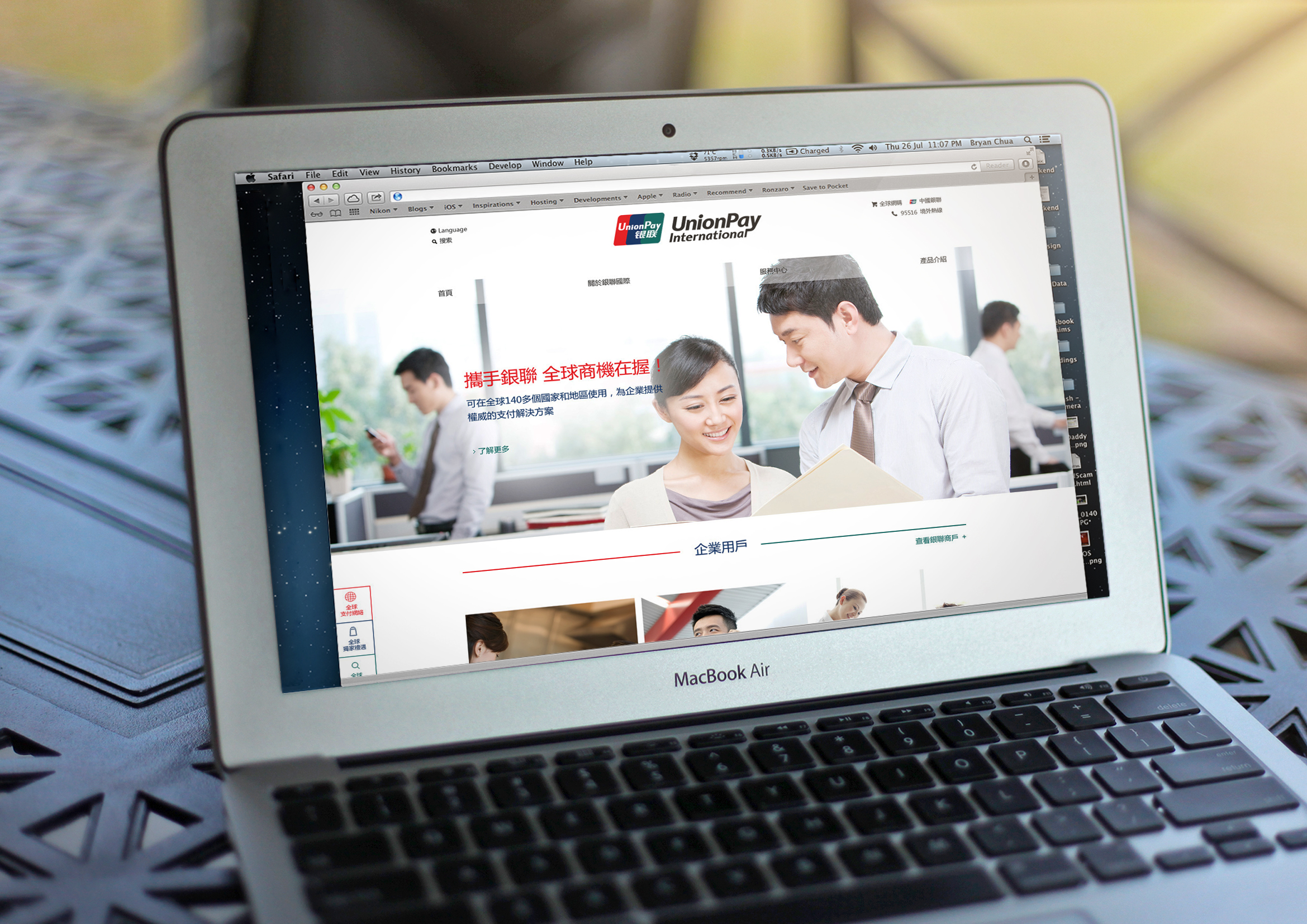
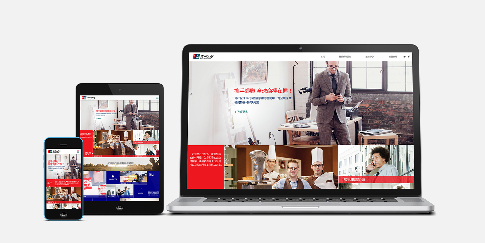
During my 3 month internship at Lowe Profero in Shanghai, one of the projects I was involved in was re-designing Chinese version of web and mobile interface for the client UnionPay.
Tools: Photoshop
Download [ORIGINAL FILES]
RESEARCH PHASE
The creative team were given a short brief by the client that they would like a redesign of the site with easier navigation and sepratation of different content shwon on the landing page.
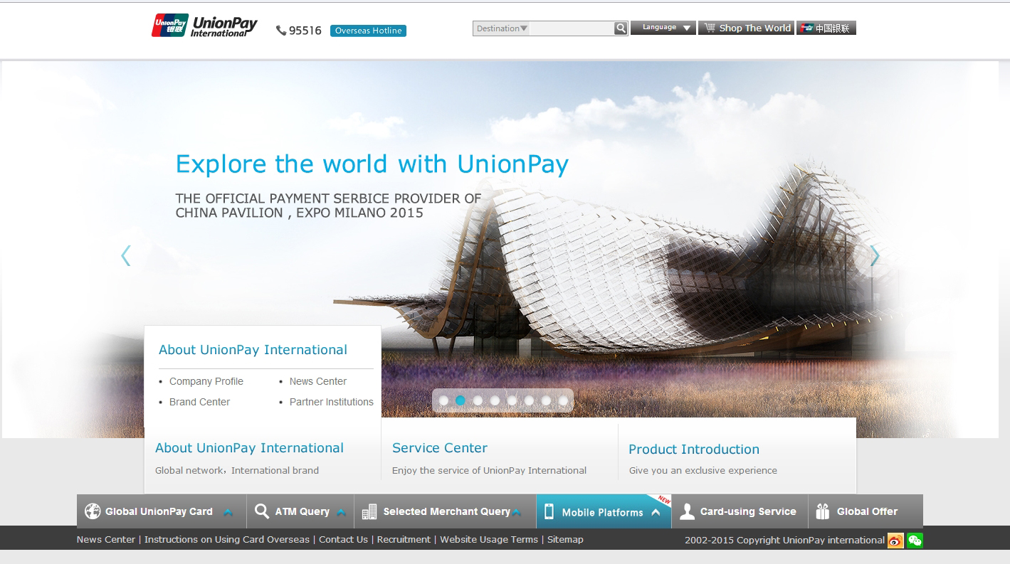
After observing and using the original site, we found that the hover over of three sections (About UnionPay International, Service Center, Product Introduction) might not be intuitive enough. Also, the amount of information (subsections and links) could be overwhelming for users especially ones with specific purposes.
PROPOSAL
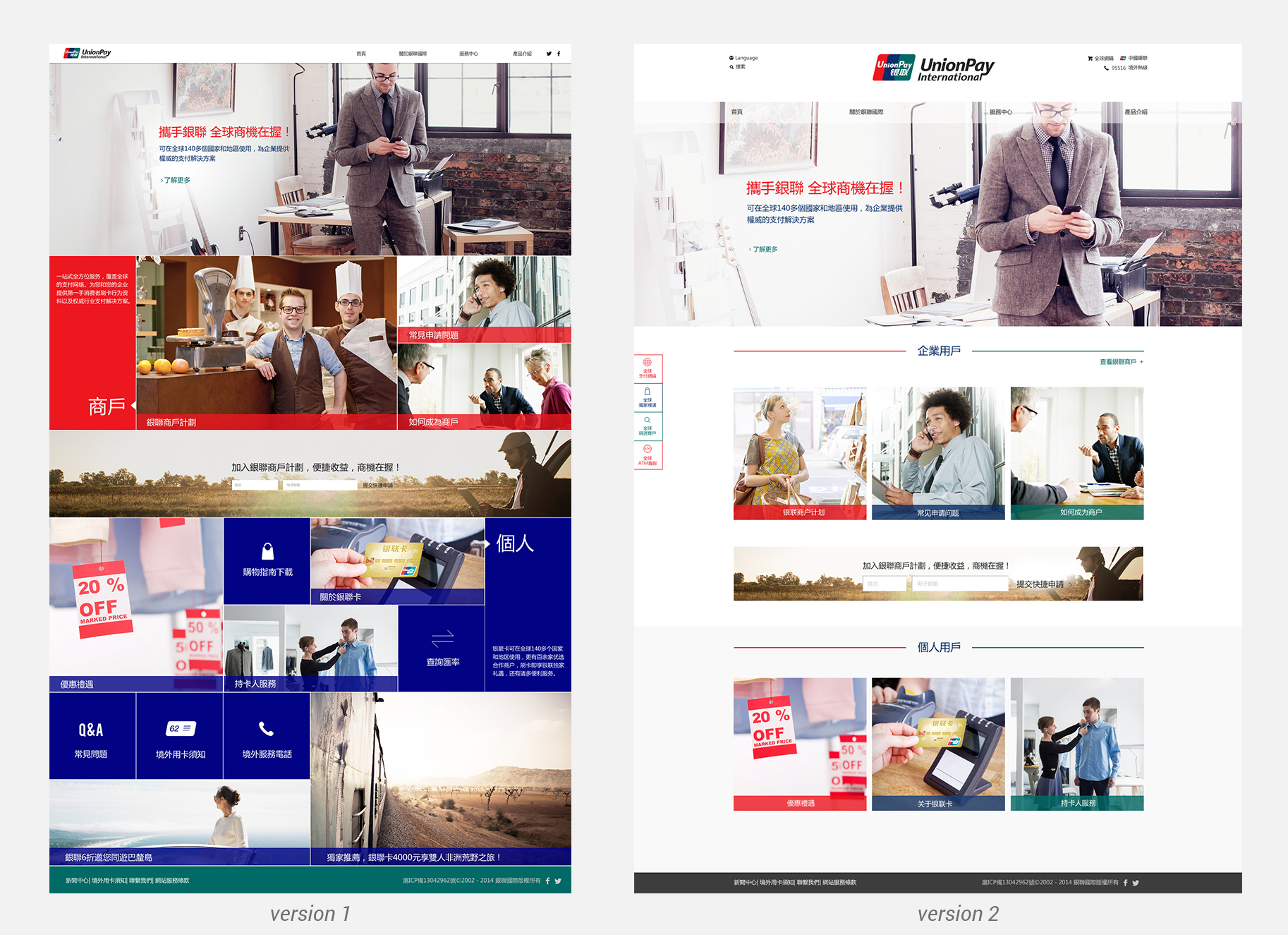
With all the content and commercial elements (carousel on original site) in mind, we eventually decided to go with a modular approach for easier distinguishing among sections. Interactions are reduced to only click and scrolling in attempt to reduce potential cognitive overload on end users.
Initially two versions were made for review.
Multi-Platform and Stock Image
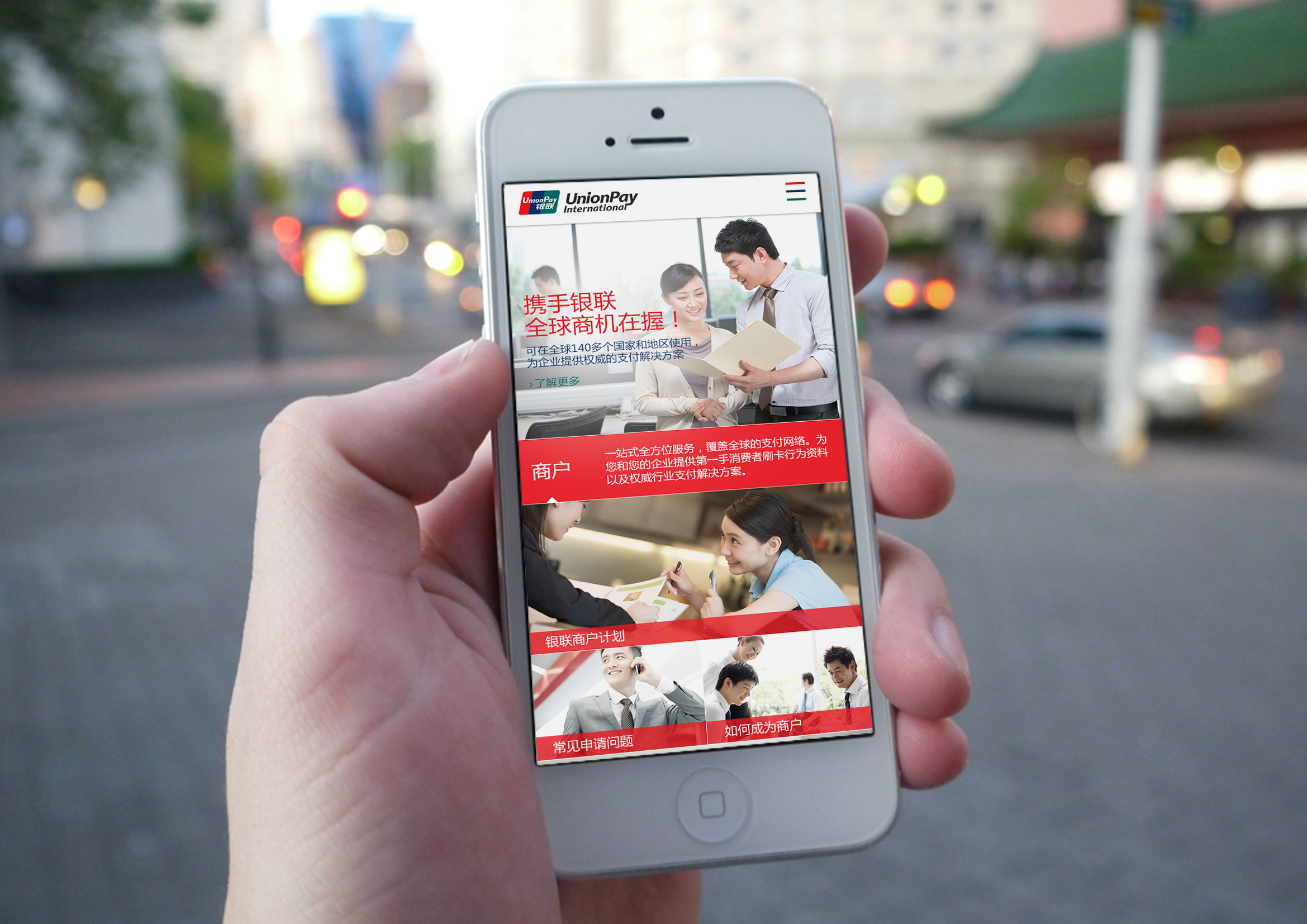
After the first version got approved by the client, interfaces with different dimensions were created for protyping on mobile devices.
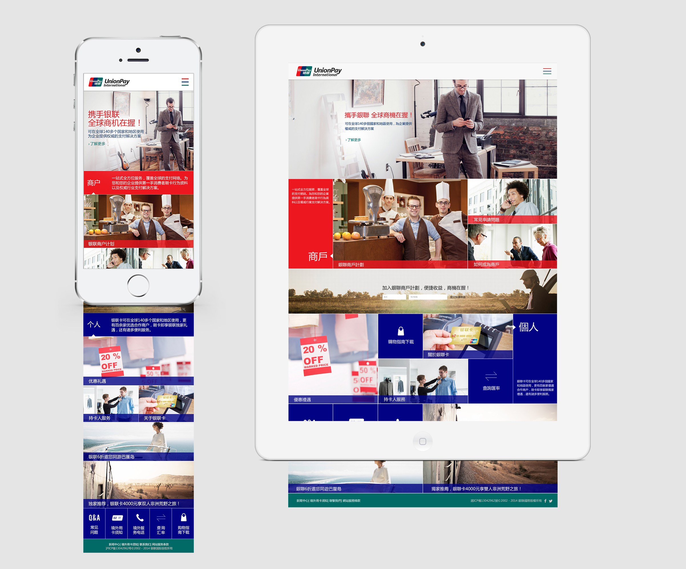
Eventually, stock images needed to be replaced to match the ethnicity of the target audience.